Colors
Colors are now one less thing to worry about.
Install
Install New UI Colors from your terminal via npm.
npm i -D @new-ui/colors
Usage
Import the New UI foundations by adding the following line at the top of your SCSS file:
@use "@new-ui/colors"; // Use `@import` for CSS
Set the theme by adding the data-new-ui-theme attribute to your HTML wrapper element, for example:
<html data-new-ui-theme="light">
| Available themes | Value |
|---|---|
| Light (Default) | light |
| Light warm | light--warm |
| Light cold | light--cold |
| Dark (Default) | dark |
| Dark warm | dark--warm |
| Dark cold | dark--cold |
Primitives
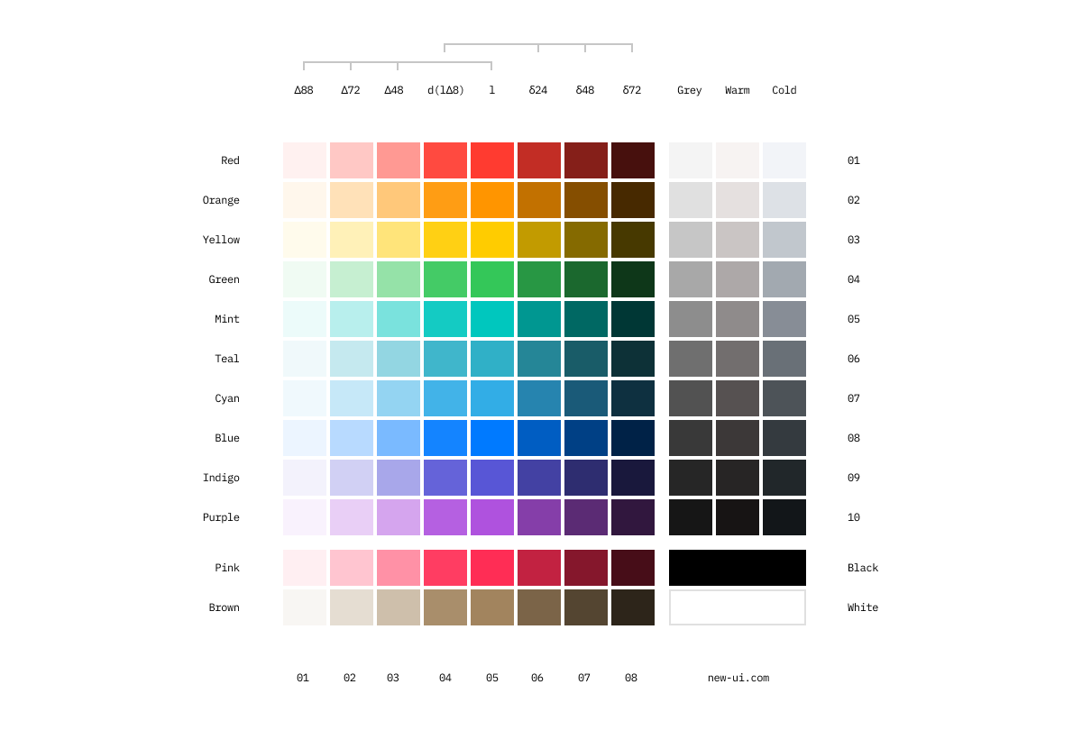
Crafted with care, the New UI color spectrum is rigorously tested and validated for accessibility, removing color concerns from your plate.

Tokens
Use role-based tokens to keep colors consistent across surfaces.
| Category | Token | Role |
|---|---|---|
| Background | --background |
Default app background |
--background-secondary |
Secondary app background | |
--background-hover |
Background hover | |
--background-selected |
UI element background | |
--background-selected-hover |
UI element background hovered | |
--background-high-contrast |
High contrast background | |
| Border | --border-muted |
Muted strokes and separators |
--border |
Default strokes and separators | |
--border-strong |
Strong strokes and separators | |
--border-inked |
Inked strokes and separators | |
--border-inverse |
Inverse strokes and separators | |
--border-focus |
Focus outline | |
| Button | --button |
Primary button background |
--button-hover |
Primary button hover | |
--button-active |
Primary button active | |
--button-disabled |
Disabled button background | |
| Link | --link |
Primary link |
--link-hover |
Hover state for primary link | |
--link-subtle |
Secondary link | |
--link-visted |
Link visited | |
| Support | --support-error |
Error |
--support-warning |
Warning | |
--support-success |
Success | |
--support-info |
Information | |
| Content | --content-primary |
Primary body copy |
--content-secondary |
Secondary content color | |
--content-secondary-alt |
Secondary content color alt | |
--content-placeholder |
Placeholder content color | |
--content-on-color |
Content on interactive color | |
--content-error |
Error message | |
--content-success |
Success message | |
--content-inked |
Inked content |
Combinations
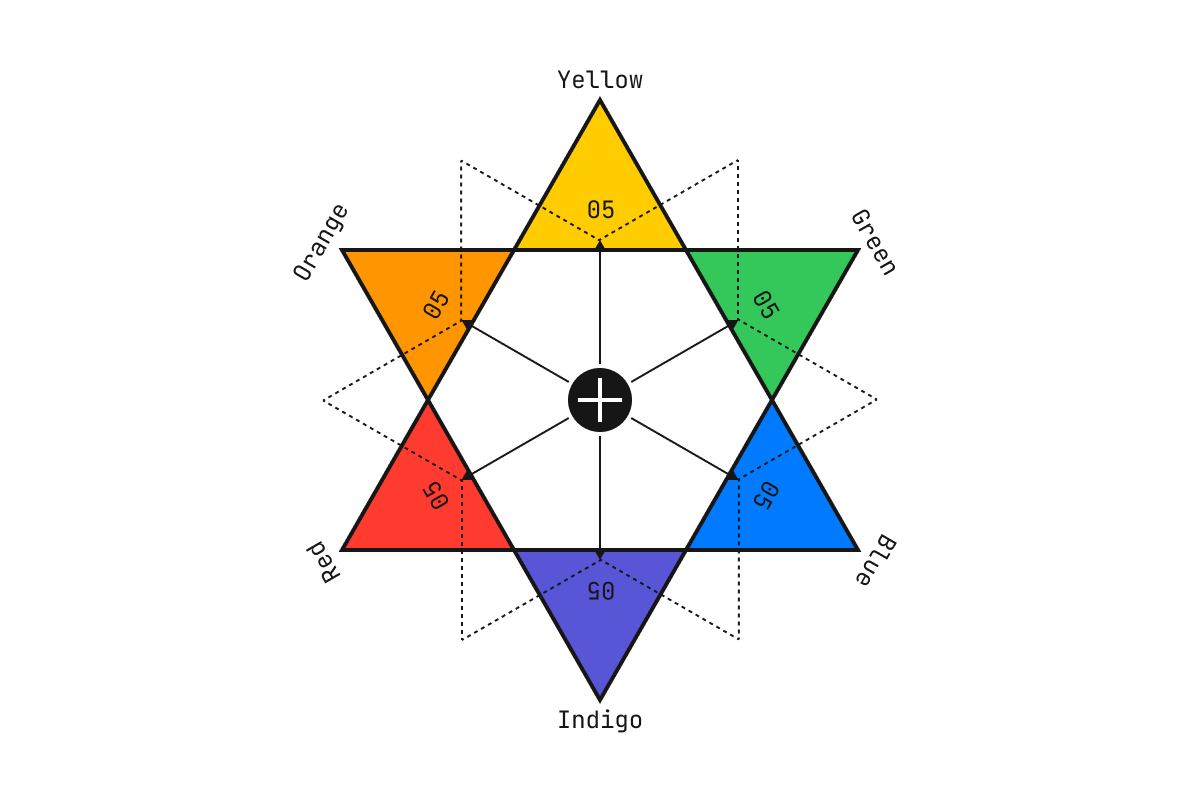
Complementary colors are shown on opposite sides. When used alongside each other, each complementary color is optically intensified.
